
Email Marketing for Mobile: Optimizing for the Small Screen
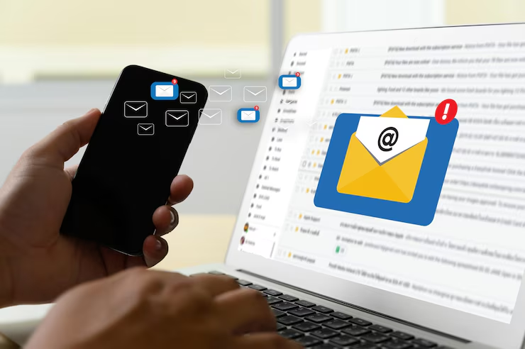
In today’s hyper-connected world, the smartphone isn’t just a communication device; it’s an extension of ourselves, a portable portal to information, entertainment, and commerce. This pervasive mobile presence has fundamentally reshaped how we consume content, including our emails. No longer can marketers afford to treat mobile as an afterthought. Email marketing for mobile: optimizing for the small screen is not just a best practice; it’s an absolute necessity for survival and success in the digital realm.
This comprehensive guide will delve deep into every facet of mobile email optimization, ensuring your campaigns not only reach but resonate with your on-the-go audience. We’ll explore the ‘why,’ the ‘how,’ and the ‘what next’ of mobile-first email marketing, leaving no stone unturned and equipping you with the knowledge to craft truly impactful mobile email experiences.
The Mobile Imperative: Why Mobile-First Isn’t Optional Anymore
Let’s face it, your audience is already on their phones. The statistics paint a clear picture: a significant majority of emails are opened on mobile devices. Ignoring this reality is akin to sending a physical letter to an empty house.
- Ubiquitous Access: Smartphones are always within reach. People check their emails on their commute, in line at the grocery store, and even while watching TV. This constant accessibility means your emails have the potential to be seen anywhere, anytime.
- Impatience is a Virtue (for Mobile Users): Mobile users are accustomed to instant gratification. Slow-loading emails, cluttered layouts, or tiny text will lead to immediate deletion. A seamless, enjoyable experience is paramount.
- The Rise of the Micro-Moment: Mobile interactions are often fleeting. Users might only have a few seconds to scan your email before moving on. Your message needs to be clear, concise, and immediately impactful to capture their attention in these “micro-moments.”
- Dominance in Open Rates: While figures vary by industry, it’s undeniable that mobile email opens consistently outpace desktop opens. If your emails aren’t optimized for mobile, you’re actively alienating the largest segment of your audience.
- Conversion Potential: A good mobile email isn’t just about opens; it’s about conversions. A well-designed, easy-to-navigate mobile email can drive clicks, purchases, sign-ups, and more, directly from the user’s pocket.
Interactive Question: How much of your email list do you estimate opens emails primarily on mobile devices? Take a moment to consider your own habits. Do you find yourself checking emails more on your phone or computer?
The Foundation: Responsive Design and Mobile-First Principles
At the heart of mobile email optimization lies responsive email design. This isn’t just about shrinking a desktop email to fit a smaller screen; it’s about crafting an email that fluidly adapts its layout, content, and imagery to provide an optimal viewing experience on any device, regardless of screen size or orientation.
However, true mobile optimization goes beyond responsiveness. It embraces a mobile-first design philosophy. This means designing for the smallest screen first, then progressively enhancing the experience for larger screens.
Key Principles of Responsive and Mobile-First Email Design:
Single-Column Layout: The multi-column layouts that work well on desktop often break or become unreadable on mobile. A single-column layout ensures a smooth, vertical scroll that’s easy to navigate with a thumb.
Generous White Space: Cluttered emails are a mobile user’s nightmare. Ample white space around text blocks, images, and buttons improves readability and reduces visual overwhelm.
Large, Legible Fonts: Small, intricate fonts are a recipe for frustration on a small screen. Aim for a minimum font size of 14px for body text and 20px for headings to ensure readability. Sans-serif fonts generally perform better on mobile.
Thumb-Friendly Buttons (CTAs): Your Call-to-Action (CTA) buttons are crucial. They must be large enough to be easily tapped with a thumb, typically at least 44×44 pixels. Ensure there’s sufficient padding around them to prevent accidental clicks on adjacent elements.
Optimized Images:
- Compress, Compress, Compress: Large image files are a major culprit for slow loading times on mobile. Compress images without sacrificing quality. Tools like TinyPNG or online image optimizers can help.
- Relevant and High-Quality: Use images that enhance your message and are visually appealing. Avoid overly complex or busy images that lose their impact on a small screen.
- Alt Text is Non-Negotiable: Always include descriptive alt text for your images. This serves two vital purposes:
- It provides context if images fail to load.
- It aids accessibility for users who rely on screen readers.
- Scalable Images: Ensure your images scale correctly on different devices without becoming pixelated or distorted.
Minimalist Design: Less is often more on mobile. Prioritize your most important message and present it clearly. Avoid excessive text, too many images, or a multitude of links that can overwhelm the user.
Clear Visual Hierarchy: Guide the reader’s eye through the email using headings, subheadings, bullet points, and strategic use of bold text. The most important information should be immediately apparent.
Interactive Exercise: Open your most recent marketing email on your smartphone. Does it adhere to the principles above? What’s one immediate improvement you could make to its mobile design?
The Opening Act: Subject Lines, Preheaders, and Sender Name
The small screen means your subject line and preheader text are more critical than ever. They are your gatekeepers, the first impression, and often the sole determinant of whether your email gets opened or swiftly deleted.
Concise and Compelling Subject Lines:
- Character Limits Matter: Mobile devices display fewer characters in the subject line. Aim for 30-50 characters to ensure your message isn’t truncated.
- Clarity and Urgency: Clearly state the email’s purpose and create a sense of urgency or curiosity.
- Emojis (Used Wisely): Emojis can add personality and stand out in a crowded inbox, but use them sparingly and ensure they are relevant to your brand and message. Test how they render across different devices.
The Power of the Preheader Text:
- Don’t Waste It: The preheader text (or preview text) is the snippet of text that appears after the subject line in the inbox. It’s prime real estate. Don’t let it be the first line of your email’s body text (e.g., “View this email in your browser”).
- Expand on the Subject Line: Use the preheader to offer more context, a compelling offer, or a question that piques interest.
- Complement, Don’t Repeat: Ensure your preheader text complements your subject line without simply repeating it.
- Hide Longer Preheader Text (Advanced): Some email clients allow you to hide the visible preheader text in the email body while still displaying it in the inbox. This can be useful for longer preheaders that provide more detail.
Recognizable Sender Name:
- Build Trust: Ensure your sender name is immediately recognizable and trustworthy. Use your company name or a recognizable person from your team (e.g., “Acme Co.” or “Sarah from Acme Co.”).
- Consistency is Key: Stick to a consistent sender name to build brand recognition and trust over time.
Interactive Brainstorm: Jot down three different subject line and preheader combinations for a hypothetical product launch. Which one feels most compelling and mobile-friendly?
Content is King, Even on a Tiny Throne: Crafting Engaging Mobile Email Content
Once your email is opened, the content needs to deliver. Mobile users are scanning, not meticulously reading. Your content must be digestible, valuable, and directly relevant to their needs.
Concise and Skimmable Copy:
- Get to the Point: Lead with your most important information. Don’t bury the lead.
- Short Paragraphs: Break up long blocks of text into short, digestible paragraphs (2-3 sentences max).
- Bullet Points and Numbered Lists: These are your best friends for breaking down information and making it easy to scan.
- Bold Key Phrases: Highlight important keywords or phrases to help users quickly grasp the essence of your message.
Compelling Call-to-Actions (CTAs):
- Single, Clear Goal: Every email should have a primary CTA. While you can have secondary CTAs, ensure they don’t dilute the main message.
- Action-Oriented Language: Use strong verbs that encourage action (e.g., “Shop Now,” “Learn More,” “Download Your Guide”).
- Prominent Placement: Place your primary CTA early in the email, ideally above the fold (the visible area without scrolling).
- Contrasting Colors: Make your CTA button stand out with a contrasting color from your email’s background and text.
- Ample Spacing: Ensure there’s enough white space around your CTA button to make it easy to tap.
Visual Storytelling:
- Strategic Image Use: Images should complement your text, not replace it. Use them to break up content, showcase products, or convey emotions.
- Short Videos/GIFs: Engaging video snippets or animated GIFs can significantly boost engagement, but ensure they are optimized for quick loading and have a clear purpose. Provide a play button overlay for videos.
- Brand Consistency: Maintain your brand’s visual identity through consistent colors, fonts, and imagery.
Personalization and Segmentation:
- Beyond First Names: Mobile users expect personalized experiences. Go beyond simply using their first name.
- Behavior-Based Segmentation: Segment your audience based on their Browse history, past purchases, engagement with previous emails, or demographic data. This allows you to send highly relevant content.
- Location-Based Offers: If relevant, use location data to send timely offers or information (e.g., “Flash Sale at your local store!”).
- Dynamic Content: Leverage dynamic content blocks that change based on user data, providing a truly individualized experience.
Interactive Poll: Which of these content elements do you find most effective in capturing your attention on mobile: short paragraphs, bullet points, prominent CTAs, or engaging visuals?
The Technical Backbone: Ensuring Flawless Delivery and Performance
Even the most beautifully designed mobile email won’t succeed if it doesn’t load quickly or reach the inbox. Technical considerations are paramount.
HTML and CSS Best Practices for Mobile:
- Fluid Layouts (Percentage-Based Widths): Use percentages for widths instead of fixed pixel values to ensure elements scale proportionally.
- Media Queries: These CSS rules allow you to apply different styles based on screen size, enabling responsive design.
- Inline CSS vs. Embedded CSS: While inline CSS is generally safer for email client compatibility, modern responsive emails often use a combination, with embedded CSS for media queries.
- Avoid Complex Code: Keep your HTML and CSS as clean and simple as possible to reduce file size and rendering issues.
Optimizing Loading Speed:
- Image Compression (Revisited): This is the biggest factor in email loading speed.
- Minimalist Design (Revisited): Fewer elements mean faster loading.
- Avoid Excessive Web Fonts: While tempting, web fonts can slow down loading. Stick to system fonts or widely supported web-safe fonts.
- Minimize Tracking Pixels: While necessary for analytics, too many tracking pixels can add to loading time. Use them judiciously.
- AMP for Email: Accelerated Mobile Pages (AMP) for Email is a game-changer. It allows for dynamic, interactive, and lightning-fast loading experiences directly within the email client, eliminating the need to click through to a website for certain actions (e.g., filling out a form, Browse a carousel). While adoption is growing, it’s worth exploring for advanced interactive elements.
Deliverability on Mobile Devices:
- Clean Email List: Regularly remove inactive subscribers and bounced email addresses to maintain a healthy sender reputation.
- Authentication (SPF, DKIM, DMARC): Implement these email authentication protocols to prove your emails are legitimate and reduce the chances of being flagged as spam.
- Avoid Spam Trigger Words: Be mindful of words and phrases that can trigger spam filters.
- Reputable ESP (Email Service Provider): Choose an ESP with a strong deliverability record.
- Easy Unsubscribe: Make it easy for users to unsubscribe. A clear unsubscribe link reduces spam complaints and helps maintain a healthy list.
- Consistent Sending Schedule: Sending consistently helps build a positive sender reputation with email providers.
Interactive Challenge: Research if your current ESP supports AMP for Email. If so, what kind of interactive element could you envision using it for in your next campaign?
Interactivity on the Small Screen: Engaging Your Audience
Mobile email isn’t just for static content. Interactive elements can dramatically boost engagement and provide a richer user experience.
Beyond the Click:
- Embedded Forms/Surveys (with AMP): Allow users to submit feedback or answer questions directly within the email.
- Image Carousels/Sliders (with AMP): Showcase multiple products or images without making the email excessively long.
- Accordion Sections (with AMP): Collapse and expand content, allowing users to delve deeper into specific sections without overwhelming them initially.
- Quizzes/Polls (with AMP): Engage users with fun and interactive quizzes or polls that provide immediate results.
- Countdown Timers: Create urgency for sales or events.
Leveraging Mobile-Specific Features:
- Click-to-Call Links: Make phone numbers clickable so users can directly call your business.
- Click-to-Map Links: Provide directions to your physical location.
- Add-to-Calendar Buttons: For events, allow users to easily add them to their mobile calendars.
Important Note on Interactivity: While exciting, not all email clients fully support advanced interactive elements like AMP. Always provide a fallback version (a static HTML version) for clients that don’t support these features to ensure a consistent experience for all users.
Interactive Thought Experiment: Imagine you’re promoting a new fitness class. How could you use an interactive element in your mobile email to drive sign-ups? (Think beyond a simple “Sign Up Now” button).
The Feedback Loop: Testing, Analytics, and Continuous Improvement
Optimizing for mobile is an ongoing process. You can’t just set it and forget it. Constant testing and analysis are crucial for success.
Rigorous Testing Across Devices and Clients:
- Emulators are Not Enough: While emulators are helpful, always test your emails on actual mobile devices (iOS and Android, various screen sizes) and different email clients (Gmail, Outlook, Apple Mail, etc.).
- Litmus and Email on Acid: These services provide comprehensive testing and rendering previews across a vast array of devices and email clients, revealing potential display issues.
- Pre-Send Checks: Before every send, verify subject line and preheader truncation, image loading, CTA button functionality, and overall layout.
Key Performance Indicators (KPIs) for Mobile Email:
- Mobile Open Rate: The percentage of emails opened on mobile devices. This tells you how well your subject line and preheader are performing on mobile.
- Mobile Click-Through Rate (CTR): The percentage of mobile opens that resulted in a click on a link within the email. This indicates the effectiveness of your mobile content and CTAs.
- Mobile Conversion Rate: The percentage of mobile email recipients who completed a desired action (e.g., purchase, sign-up) after clicking from the email. This is the ultimate measure of success.
- Bounce Rate (Mobile Specific): A high bounce rate on mobile could indicate issues with deliverability or poor mobile rendering leading to immediate deletion.
- Time Spent on Email (where available): While harder to track precisely, an increase in time spent suggests more engaging content.
A/B Testing for Mobile Optimization:
- Subject Lines and Preheaders: Test different variations to see what resonates best with your mobile audience.
- CTA Button Text and Color: Experiment with different wording and colors to optimize click-throughs.
- Image Usage: Test emails with more or fewer images, or different image types, to see what performs best on mobile.
- Content Length: Compare short, concise emails with slightly longer, more detailed ones (though usually shorter wins on mobile).
- Placement of Elements: Experiment with the positioning of your CTAs, key messages, and visuals.
Gathering User Feedback:
- Surveys: Include short, mobile-friendly surveys in your emails to gather direct feedback on their experience.
- Heatmaps (if supported by your ESP): Understand where users are clicking and scrolling within your emails.
Interactive Challenge: Based on the KPIs mentioned, what’s one specific metric you’d prioritize for your next mobile email campaign, and why?
Beyond the Basics: Advanced Strategies for Mobile Email Marketing
Once you’ve mastered the fundamentals, consider these advanced strategies to further elevate your mobile email game.
Contextual Email Marketing:
- Real-time Data: Leverage real-time data (e.g., current weather, local events, trending products) to make your emails hyper-relevant at the moment of open.
- Dynamic Content (Revisited): Tailor content based on the user’s location, device, or even time of day.
Deep Linking:
- Seamless User Journey: Instead of sending users to a generic homepage, deep links take them directly to a specific product page, app section, or relevant content within your app. This minimizes friction and improves the user experience.
Integrations with Mobile Apps:
- Push Notifications: Use email to encourage app downloads or to inform users about features within your app, potentially linking directly to them.
- In-App Messaging: Coordinate your email campaigns with in-app messages for a consistent and integrated communication strategy.
Accessibility for All Mobile Users:
- Screen Reader Compatibility: Ensure your email HTML is structured semantically to be easily interpreted by screen readers. Use proper heading tags ($\), list tags ($\), and alt text for images.
- Color Contrast: Ensure sufficient color contrast between text and background for users with visual impairments.
- Avoid Flashing Elements: Flashing or blinking elements can be disorienting or even trigger seizures for some users.
- Logical Reading Order: Design your email with a logical flow that makes sense to screen readers.
- Plain Text Version: Always provide a plain text version of your email for users who prefer it or whose email clients don’t render HTML well.
Leveraging AI in Mobile Email Marketing:
- AI-Powered Personalization: AI can analyze vast amounts of data to predict user preferences and deliver truly individualized content and offers.
- Optimal Send Time Prediction: AI algorithms can determine the best time to send emails to individual users based on their historical engagement patterns.
- Automated Content Generation: AI can assist in generating compelling subject lines, preheader text, and even email body copy, optimized for mobile readability.
- Enhanced Segmentation: AI can identify subtle patterns in user behavior to create even more precise segments.
Interactive Question: How do you currently (or plan to) integrate your email marketing with your mobile app strategy? Or, if you don’t have an app, how could you leverage deep linking to enhance your mobile user journey?
The Future of Mobile Email Marketing: What’s Next?
The landscape of mobile email marketing is constantly evolving. Staying ahead of the curve means anticipating future trends.
- Further Adoption of AMP for Email: As more email clients support it, AMP will likely become a standard for creating highly interactive and engaging mobile email experiences.
- Increased Focus on Privacy and Data Security: With evolving regulations (like GDPR and CCPA) and increasing user awareness, brands will need to be even more transparent and responsible with user data.
- Hyper-Personalization Driven by AI and Machine Learning: The ability to deliver truly 1:1 experiences will become even more sophisticated, with AI tailoring not just content but also layout and interactive elements based on individual user behavior.
- Voice Search and Smart Assistants Integration: While nascent, expect to see advancements in how emails might integrate with voice commands and smart assistants on mobile devices.
- Gamification: Incorporating game-like elements (e.g., quizzes with rewards, interactive challenges) into mobile emails can boost engagement and retention.
- Sustainability in Email Marketing: As environmental awareness grows, marketers might focus on optimizing emails for smaller file sizes to reduce carbon footprint, although this is a less dominant trend.
- Even More Focus on the User Journey: Mobile email will be viewed less as a standalone channel and more as an integral part of a holistic, personalized customer journey across all touchpoints.
Interactive Discussion Prompt: What emerging mobile technology or trend do you believe will have the biggest impact on email marketing in the next 3-5 years?
Concluding Thoughts: The Small Screen, Big Opportunity
Optimizing your email marketing for the small screen is no longer a luxury; it’s a fundamental requirement for connecting with your audience effectively. By embracing responsive design, prioritizing mobile-first principles, crafting compelling content, ensuring technical excellence, and leveraging interactive elements, you can transform your emails from a mere communication tool into a powerful engagement and conversion engine.
Remember, the goal isn’t just to make your emails readable on a phone; it’s to create an experience that feels natural, intuitive, and valuable within the context of mobile usage. The constraints of the small screen, when approached with thoughtful design and strategic content, become fertile ground for innovation and deeper customer relationships.
So, go forth and conquer the small screen! Your mobile audience is waiting. By putting them first, you’ll not only see your engagement metrics soar but also build stronger, more loyal connections in this mobile-driven world.
